Predicting USA COVID-19 Cases as if States were Their own Nations
Adapting to a "[COVID] New World" with data and good 'ole EDA + KNNs - why California's cases look more like Switzerland's on the decline while Alabama's resemble Sweden at it's apex.
April 12, 2020
- Propose forecasting of USA state COVID-19 case counts based on trending historical data from nations around the world
- Approach offers persuasive alternative to more data-hungry ML solutions given most states have little to no historical data at time of writing and benchmarking to a country offers more relatability than a statistic (e.g., we observe that California's current situation resembles the Nordic countries during their steady decline while Alabama's looks more like Sweden's at its apex)
- Recognition that research and efforts still highly in motion with reality on the ground being more complex than simple case counts; overall, remain optimistic given this is the most united the world has ever been
- (April 19 Update) Aggregated 7-day predictions closely track actuals
Like you, I’ve been affected by COVID-19.
I know folks who've contracted it. I’ve experienced its economic furor. I’ve been treated differently. I was even almost trapped on a remote island in the Pacific because of it - thrice.
Expanding on that last one, as many Asian borders rapidly closed in mid March 2020, I found myself checking the news and various countries' CDC sites an excessive amount - far more than is healthy. I was basically glued to the screen at the time. Except, unlike the normal 24/7 news cycle, it was... almost worth it to be checking the news every few minutes.
(In one particular 36 hour period, the Luzon island of the Philippines declared a lockdown effective the following day which influenced 50mm people, followed by Singapore implementing national quarantines for all foreigners, followed by Taiwan banning all foreign nationals, followed by Singapore banning all foreigners...)
Reflecting on it all, I found that the whole experience was not only stressful, but also pretty… ineffective.
Problem
Why ineffective? To start:
-
Trending data: The latest daily counts were often available, but it was unclear how the counts trended historically. 8,000 cases could be a scary number, but knowing it’s on the rise puts the scare in context. So, what’s the trend for these number(s)? How do these trends compare by country?
-
Case momentum: Expanding on the trends in the data, are cases accelerating or decelerating around the world?
-
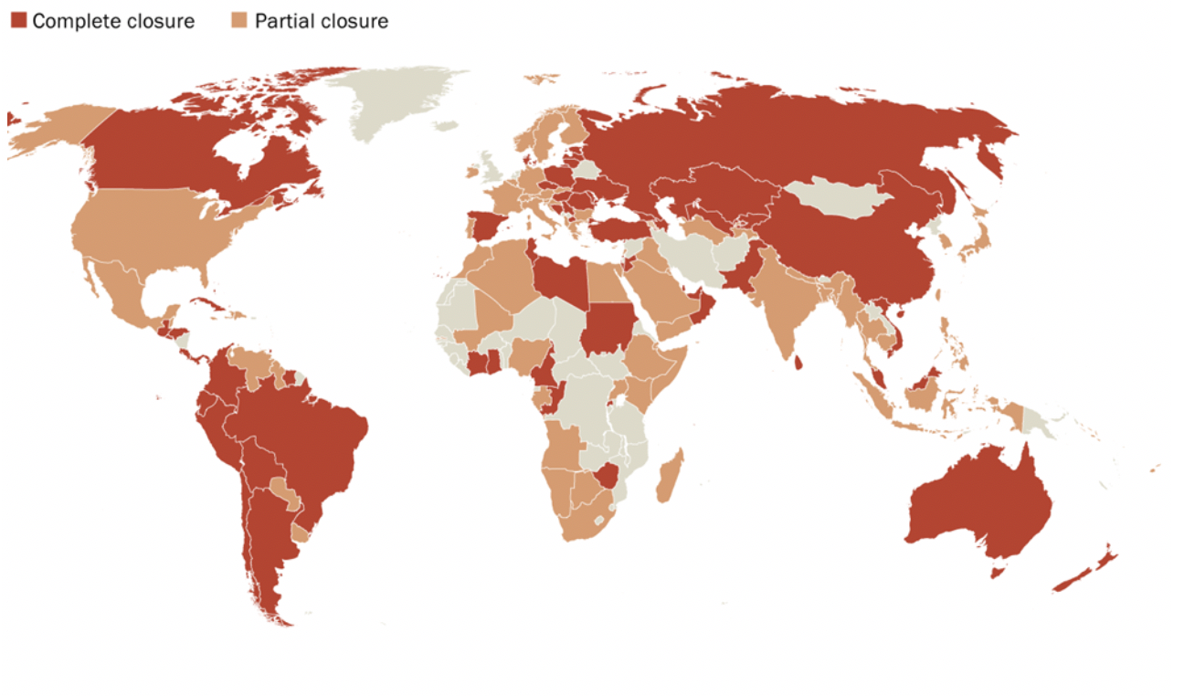
Conflicting policies: A country would implement a policy but a province may staunchly have the opposite stance (till the following day at least), companies would be caught in the rapid flux of these policies and have equally confusing policies as a result, etc.
The problem and stress at the time mostly boiled down to a major lack of clarity in how the world was shaping and there being no central playbook shedding light on the cohesive global direction. The underlying desire here was to have more control of my future, as meager as that was.
- What are the next upcoming epicenters/hotspots likely to shut down borders imminently and restrict travel?
- What was on the roadmap for my motherland country of the US? Was it wise for citizens abroad to return?
- What countries have a better handle on the crisis vs just deflating their numbers?
- Should investment strategies be realigned to a new reality? How should they be realigned?
The Solution
So, as always, I went to the source data and started mucking around.
Rather than sift through the conflicting messages or manually compare figures daily, I leveraged the data many agencies are basing their conclusions off of. This produced two main outcomes I’ll detail below with a few examples in each.
Consolidated, Aggregated Trends that Identify Milestones and Put Them in Perspective
“USA! USA! USA!” - When it was clear we were on the path to leading the world in confirmed COVID-19 cases
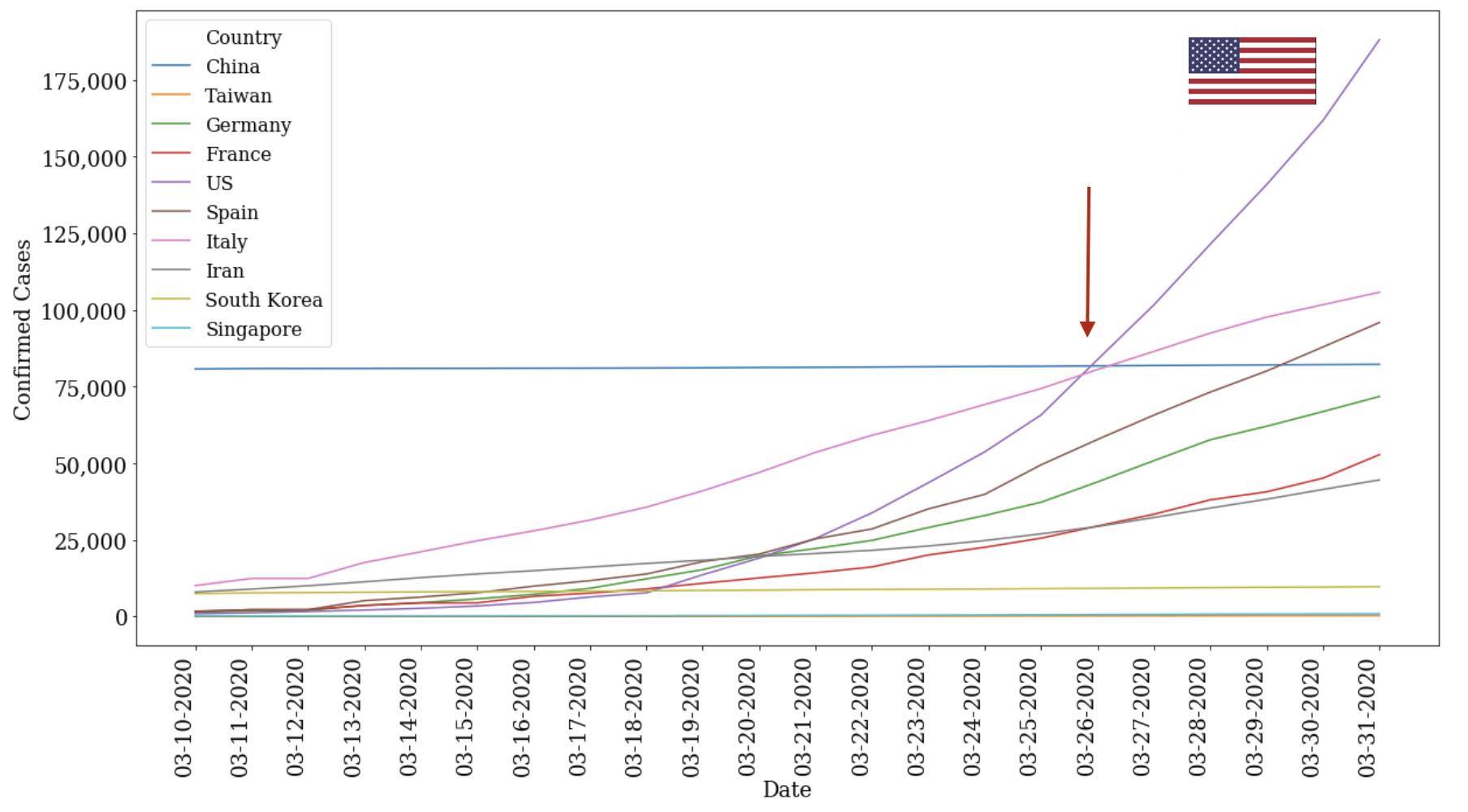
- There was once a time where it seemed crazy that my home country (USA) could ever be where it is today - leading the pack in COVID cases by nearly 3x. Even as late as the end of March, media and analysts could often be found restating that there were only 250 new cases in Washington! Only 750 new cases in New York! And so forth...
- The numbers might've been meaningful but honestly lacked the key context of historical trends to make sense of them (were the case counts on the exponential, how much was this a change from the prior day % wise, where may we be in 2-3 weeks, etc). Coalescing the numbers, though, it became pretty clear, pretty fast that we (the US) were out to win the gold medal here. See the light purple line and how the US eclipsed all of its “competitors” in the span of a month going from basically no confirmed cases to 200k.
- While Italy was the focus of the news, we can see that the slope of the USA's curve was lurking in the shadows and quickly bends to close the gap starting in early-to-mid March.
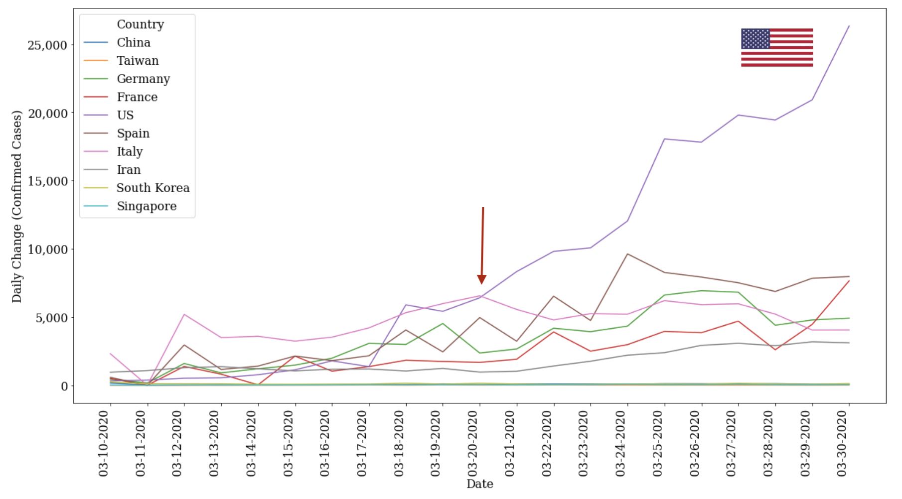
- Focusing more on the daily change, we in the USA also are not taking our feet off the gas pedal fast enough. See in the chart above how we’re also extending our lead with each passing day by having the highest change in confirmed cases on a day-to-day basis. We’ve now maintained this lead for 20+ consecutive days. As of now, we currently 3x the nearest country at over 30k cases a day versus sub 10k cases for the rest of the pack (albeit, confirmed cases is highly correlated with number of tests which is addressed at the end of this)
- What I’d also call out here is that we can also see how the early centers for the pandemic (China, South Korea) as well as countries being praised for their prevention of exposure (Taiwan, Singapore) have firmly developed a handle on their crises in their own ways. Each now has case count growths very close to 0, and will be case studies both imminently and in years to come as every country seeks preparation for the coming waves.
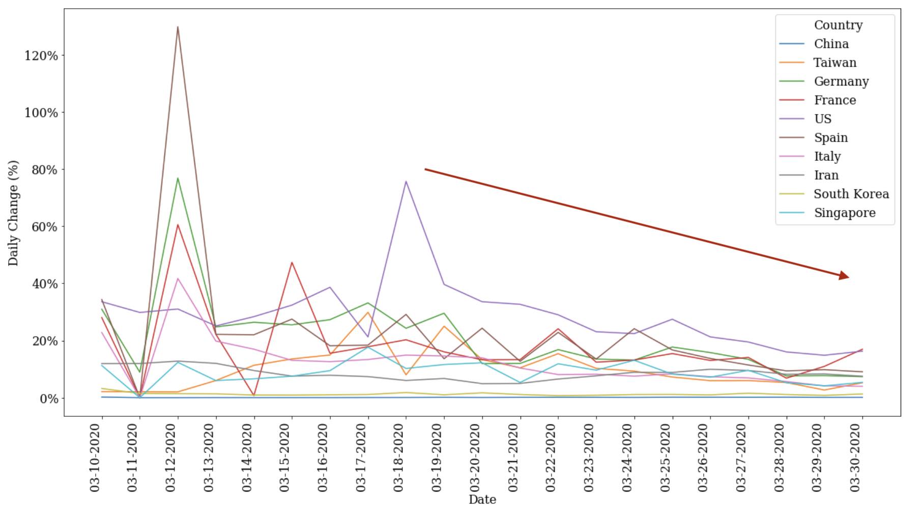
- Lastly, if we look at the “next order” change in case counts representing acceleration/deceleration of cases, we can see the early signs of positive impact of most western countries containment measures. See that down-and-to-the-right trend above? That represents how these select countries are generally succeeding at slowing down and impeding the spread of the virus. This is a positive trend but generally seen as moving still too slow given the long fat tail of this curve.
- Note that Singapore (light purple line) is actually back on the rise again. This correlates with their more drastic measures as of late to reengage lockdowns and contain the pandemic)
The United “Nations” of America - Forecast of US National COVID-19 Cases Based on a K-Nearest Neighbor (KNN) Algorithm Fit to Global Country Data
The real value of history only comes to fruition when we:
- Acknowledge it
- Learn from it
- Translate those lessons into action
In this case, I’ve attempted to put these lessons into action by predicting USA COVID-19 case counts a small window into the future. The benefit of this exercise is multifold from grounding personal optimism to warning friends and families in advance to correlating it with market investments.
There are a few issues to address first though. Namely, the data.
There has not and is still not enough organized public data including the virus’ behavior, the conditions of each country that likely contribute to the virus’ spread (e.g., healthcare system), and the flow of humanity. Even if most of this was available, the data is fairly sparse given most countries have only tracked data for a little over the month. Many US states only began tracking their case counts in mid March. Combined, these factors lead to challenges in implementing a typical time series model and lead to insufficient data for a “deep" learning model.
To resolve these gaps, my approach was to:
- First, predict the trajectory of each state based on the countries it resembles at any given time of its COVID-19 case count trajectory. This translates into a K-Nearest Neighbors problem.
- Second, sum up these predictions to an aggregate US number which in essence creates a bottoms up model.
This solution tests the common refrain that the US states are in essence individual countries at times (to be fair, many states are often the size of individual countries).

If so, why not predict the states as if they were countries? By doing so, we also avoid the current lack of historical data available across most states and can more closely examine the subtle trends across states that are lost in an aggregate US prediction.
The implementation can be found HERE with takeaways below:
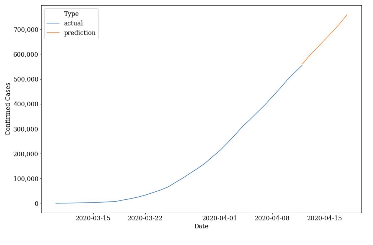
- We’re still far from out of the woods as the model predicts the US will grow over 200k cases to ~760k on April 18 with a growth rate that still has yet to quickly taper. **(April 19 Update: Nearly on goal with April 18 actuals being ~740k)
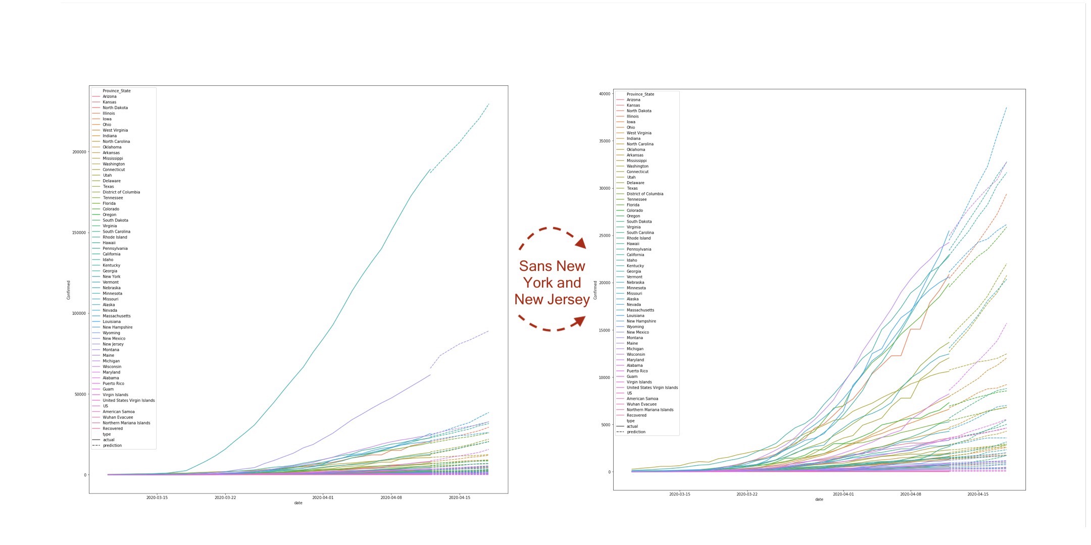
- This growth is largely attributed to not just the more densely concentrated hot beds like New York but the also the growing centers all around the country. As an example, look how over 5 states will surpass 30k in the coming days in the right graph that removes New York and New Jersey (lots of text... so best to just zoom in for general details).
- Given the model is based on a KNN architecture, an additional benefit we gain is also seeing which country each state most closely resembles at any historical data point. This translates into knowing whether New York still looks more like Italy at its peak, has shifted to look more like South Korea, or is somewhere in the middle. In other words, this helps to contextualize…well, the "state of each state."
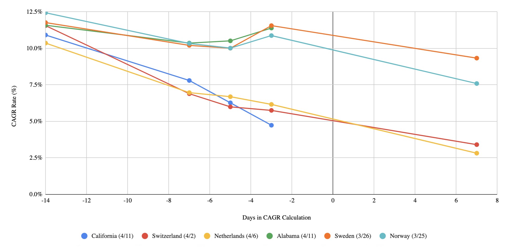
Given I'll be the first to admit this chart could be a little confusing, note that the X-axis reflects the amount of days used in the CAGR (Compound Annual Growth Rate) calculation. For instance, -3 days correlates to the 3-day CAGR of COVID cases as of the date of each country in the legend. Another example, 7 days correlates to the CAGR of COVID cases 7 days after the date in the legend (hence California and Alabama don't have predictions given I finished this on 4/12/2020)
- Given how stories and benchmarks tend to hit home harder than raw numbers, I’ve found these comparisons to be fairly effective in having other’s take a problem more seriously. For example, California's current closest benchmark is Switzerland right as they started to really break the curve while Alabama's trajectory looks more like Sweden and Norway right as they entered their steepest inflection point.
Reflection
The increasing availability of data publicly is what makes ventures like the above and beyond possible. It’s one of the key factors that lead to the rapid progression of the machine learning field, and it’s also key to how the world will contain this pandemic (understanding the virus behavior based on commonalities in cases, political policy based on country aggregate trends, etc).
Caveat here is that some/much of the data has been known to be under-reported. This is important because inaccuracy can snowball into another country/province making inaccurate decisions based off omitted data. Serious considered tradeoffs lead to these decisions such as political perception (Japan for the olympics, China for trade) or prohibitively expensive testing vs just shutting down of countries (Philippines / Russia), etc. (Check out FiveThirtyEightfor a more detailed writeup on under/over/dramatic shifts)
I’m a firm believer that next level analyses will harmonize these gaps as more data continues to come online such as test data, imported vs local transmission, deaths, healthcare capabilities, national policies in place, etc. Unfortunately, a lot of this is still influx today which means really very little of the data is available to fuel nuclear engines like the ML community.
But I hope and know that we will radically make progress in these directions. Truth supply / demand curves will continue to build off each other with compounding reinforcement. After all, this is the most united the world’s ever been.
Even more than WWII. Back then, the world was split in two, neutral countries existed, and some countries were so remote that the war really had no impact on them.
Not this time. We’re all in this together.
Methodology and Credits
All source code, training data, and project notes can be found on my Github.
Raw data courtesy of John Hopkins University who's done much of the legwork in aggregating the data.